7 Signs Of A Great Subway Advertisement
Deprecated: preg_split(): Passing null to parameter #3 ($limit) of type int is deprecated in /home/dailwtkh/public_html/wp-content/themes/jannah/framework/functions/post-functions.php on line 863

Every subway ride is a journey, whether it’s a long ride across town or a short trip from A to B. Along the way you’ll experience various sights, sounds of the city, and ads (of varying quality).
We might not think about it consciously, but these ads make an impact and influence our shopping decisions, especially if we ride the subway daily. What are the elements of a winning subway ad, and how can marketers apply these lessons in future campaigns?
Let’s walk through seven sure signs of great subway advertising so that you can position your brand for success from station to station.
1. Eye-Catching
The first rule of ad creation is universal, but counts for even more in the subway. An eye-catching ad is crucial in a public transit setting due to all the distractions, including the people, the movement, and the ever-present smartphones.
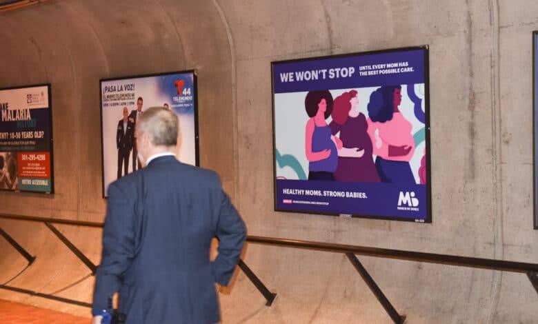
An ad in a station or train car should draw the eye, but must also strike a balance so as not to be abrasive or over-the-top. This explains why many modern subway ads take a colorful yet subdued approach with soft, cartoon-style artwork.
There are no hard rules to follow here in terms of design, but make sure your ads aren’t a bore or an eyesore.
2. City Specific
New York, Los Angeles, Washington DC – each city is unique and the subway system reflects that personality. This not only applies to the infrastructure of the trains, tracks, and stations, but also to how advertisements work in the context of a commute and the flow of traffic.
As an advertiser, your responsibility is to figure out these unique characteristics of each city and use them to your advantage when crafting a campaign.
You also have a powerful asset in your playbook with subway advertising, which is mentioning city-centric features that engage viewers and relate to their way of life. Build your ads with the city in mind to succeed.
3. Well-Formatted
Every subway ad has different dimensions and placements within the physical space. Be sure you know these intricate details when designing a campaign, making no assumptions.
Many subway ads fall flat because the formatting is done haphazardly without regard for the perspective of the viewer. Consider factors like typeset, image size, proportions, and line of sight for passengers.
Remember: the experience of viewing a subway ad is distinct from scrolling on social media or flipping through TV channels. This is a dynamic, interactive environment with many more variables at play, so don’t let any details slip by in the design process.
4. Memorable Message
All ads need a message at the core, and subway ads need to get the information across fast.
Passengers may only view an ad for two or three seconds in passing before they need to catch a train or depart at the next stop.
On the other hand, some riders will view the same ad for several minutes at a time on a long trip, so a layered message could be more useful in this context. Giving audiences something to chew on for longer journeys may play to your advantage, especially in the actual subway cars.
5. Cohesive Theme
From colors and characters to language and logos, your brand should be instantly recognizable and suited to other marketing assets in your repertoire.
Subway ads are, after all, another component of your broader branding strategy and should be treated as such – even with unique elements involved.
Throughout the day, your audience may see various “chapters” of the same ad campaign in different locations and contexts. This is how you create a compelling narrative and draw new customers into the world of your brand.
6. Clear CTAs
No ad is complete without a call to action, especially on subways where everyone is a smartphone tap away from your website and social pages.
Encourage viewers to connect with your brand online and sign up for an email newsletter or become a follower on social media.
If you can accomplish this feat with only a small fraction of daily subway passengers, that’s a huge win that will pay off in time.
7. Beginning of a Journey
Whether it’s a sign-up bonus or product promo, a subway ad is the first step in a (hopefully) long and fruitful customer relationship.
Keep building on an ad format that works and develop a lasting identity that attracts new customers while rewarding the old. Before long, your brand will be part of the fabric of the city and maintain a positive reputation that lasts for years to come.
Turn Subway Commuters into Customers
A city’s subway system is its heart and soul, and advertisements are a key part of the changing scenery. Master the craft of subway advertising and watch your brand ride its way to success in no time.
For more valuable information visit this website


