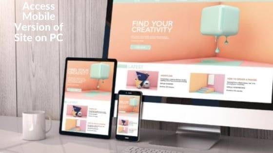
How to Access Mobile Version of Site on PC
Access Mobile Version of Site on PC
Deprecated: preg_split(): Passing null to parameter #3 ($limit) of type int is deprecated in /home/dailwtkh/public_html/wp-content/themes/jannah/framework/functions/post-functions.php on line 863

How to Access Mobile Version of Site on PC
There is no doubt that today many people use their tablets and phones to access websites to shop, browse, or do other things on the internet. Although companies know how significant mobile experience is, most marketers prefer a desktop experience because the way marketers manage sites and consumers use the website is different.
For instance, assume you are browsing your site from a desktop, and a customer is browsing on their tablet. You receive an email from your site developers about a new feature included on your site.
On your computer, you select the link and evaluate the change. All is well, and you accept the change. This is everyday workflow when a site is being developed.
However, it makes it very easy to let slip website experience on mobile devices, and that could cost you customers, if they face many problems on your site. Therefore, how do you solve that?
The first method is to take your phone and try everything to view your site the way consumers do. However, this method has a lot of friction in that you have to exchange gadgets.
Maybe you have one phone and no access to a tablet at that instant. Moreover, you may not have the development site link on the phone, making this method highly unsuccessful. Luckily, there is a better way!
There is a feature on Chrome that enables you to access a mobile version of the site on your PC. So to use this handy feature called Devtools follow these instructions:
Steps to Access Mobile Version of Site on PC:
- Press F12 to open DevTools
- Select Device Toggle Toolbar
- You will see a list of Android and iOS devices. Select the one you want to simulate.
- After selecting your preferred device, it will show the mobile version of your website.
Note that the above method only allows you to simulate various viewports on your PC. But it isn’t the most accurate method of accessing a website’s mobile version because it is only a simulation of a device.
It’s not capable of simulating every aspect of an actual phone. If website developers want correct test insights, they need to carry out extensive testing on actual devices if they do not want to compromise. This will allow them to view sites in real customer conditions.
Summary:
Looking for a way you can access the mobile version of your site is an excellent idea because it helps you know how real customers view your website and if there are any changes you need to make.
Using Chrome’s DevTools is the right way of doing that. However, it is not the most effective way of testing sites, although it is better than exchanging devices. Actual device testing is the best way to view the mobile version of your website as it helps you discover problems that you can’t see in Chrome.
Using DevTools will help you know and solve any possible issues that real customers could experience without consuming much of your time and interfering with your day-to-day duties. Now you know how to access the mobile version of the site on a PC.


I was suggested this web site by my cousin. I am not sure whether this post is written by him as nobody else know such detailed about my trouble. You are wonderful! Thanks!|
Nice post. I was checking constantly this blog and I am impressed! Very helpful info specifically the last part 🙂 I care for such info much. I was looking for this certain info for a very long time. Thank you and good luck.|